StartEngine Raise Capital
Client
StartEngine
Role
Senior Designer
Problem Statement
How can you assist a brand when a critical website landing page and form is suffering from significant user drop-off issues?
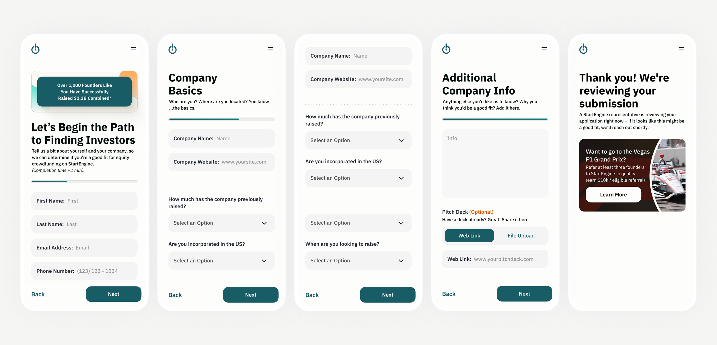
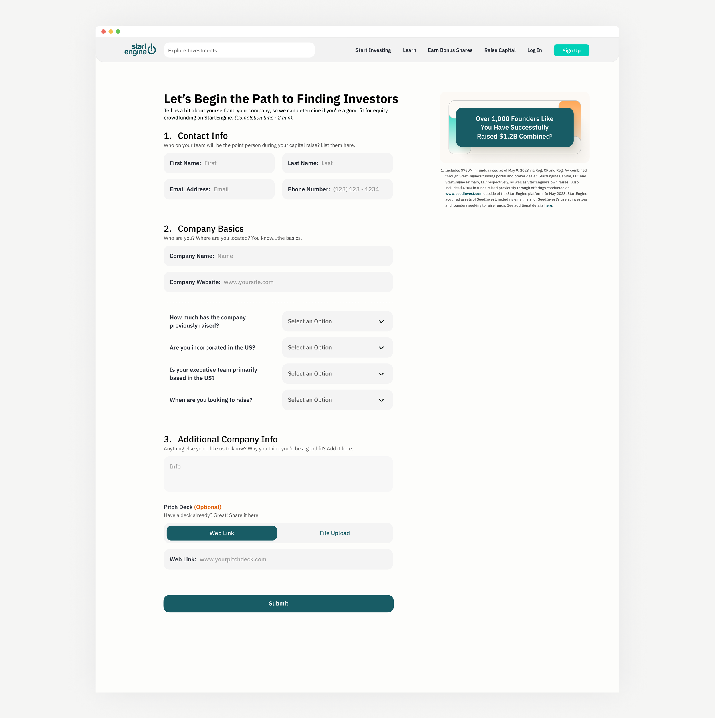
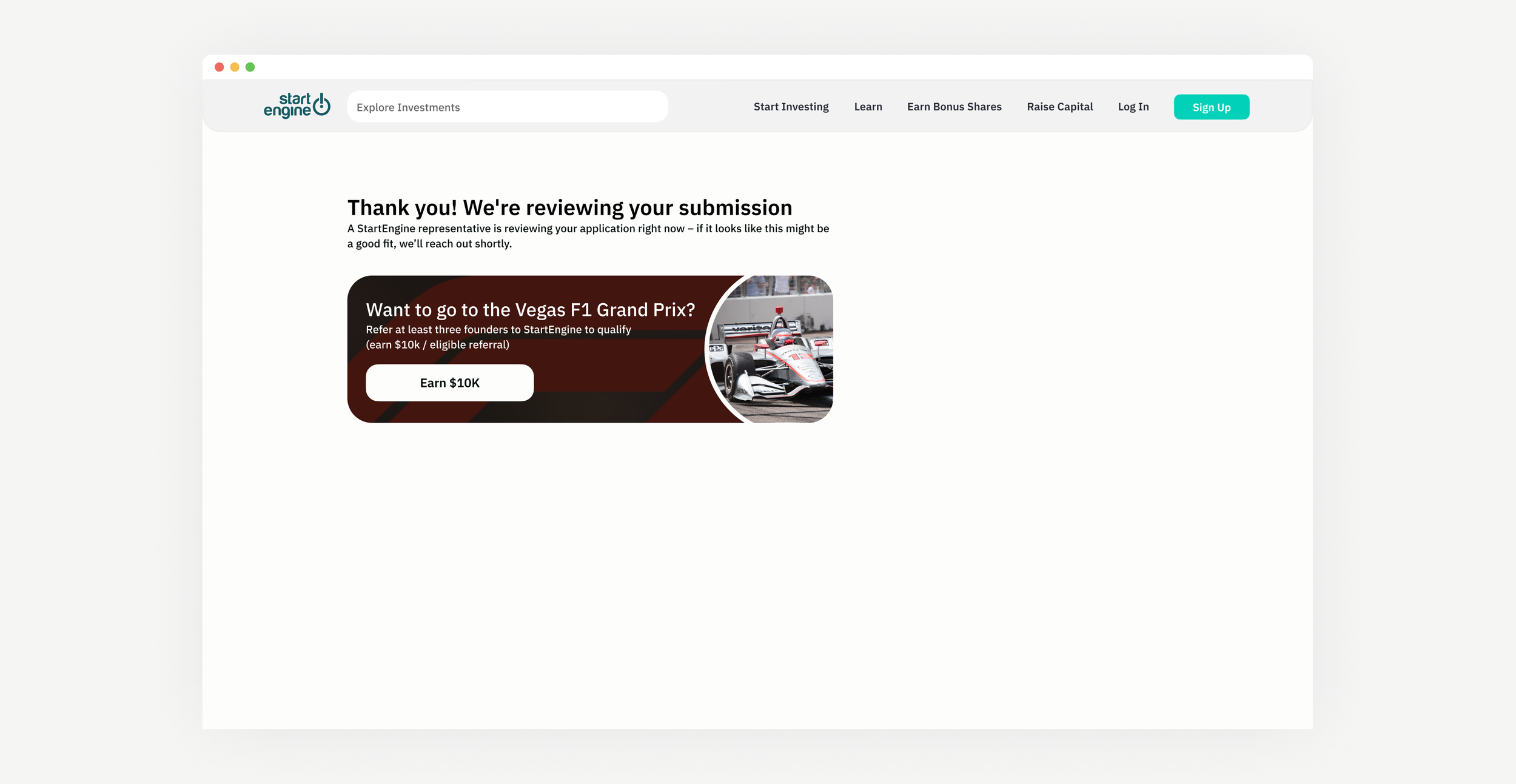
For StartEngine’s Raise Capital landing page, I consolidated content and cast it in our redesigned brand to ensure brand consistency. For the form embedded in the page, I redesigned and simplified the desktop and mobile versions, while simultaneously making the mobile version more user-friendly by splitting it into four pages with a progress bar. I also enhanced the written content to make it more engaging, transforming a previously daunting form into a more user-friendly experience. Furthermore, I introduced a new user touchpoint on the thank you page of the form, providing an opportunity for users to take action where there was previously a dead end.
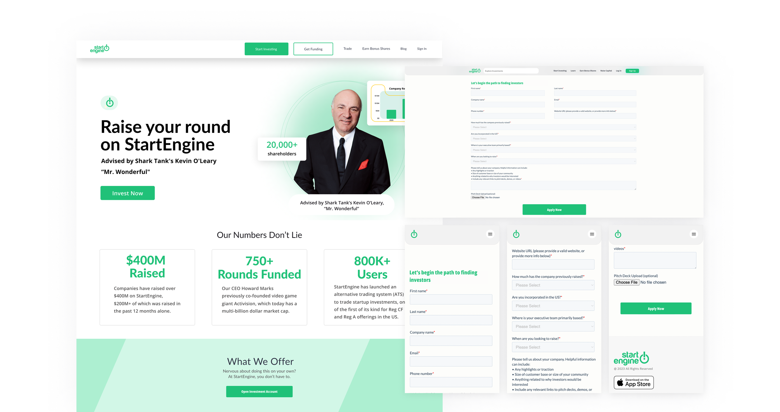
Before
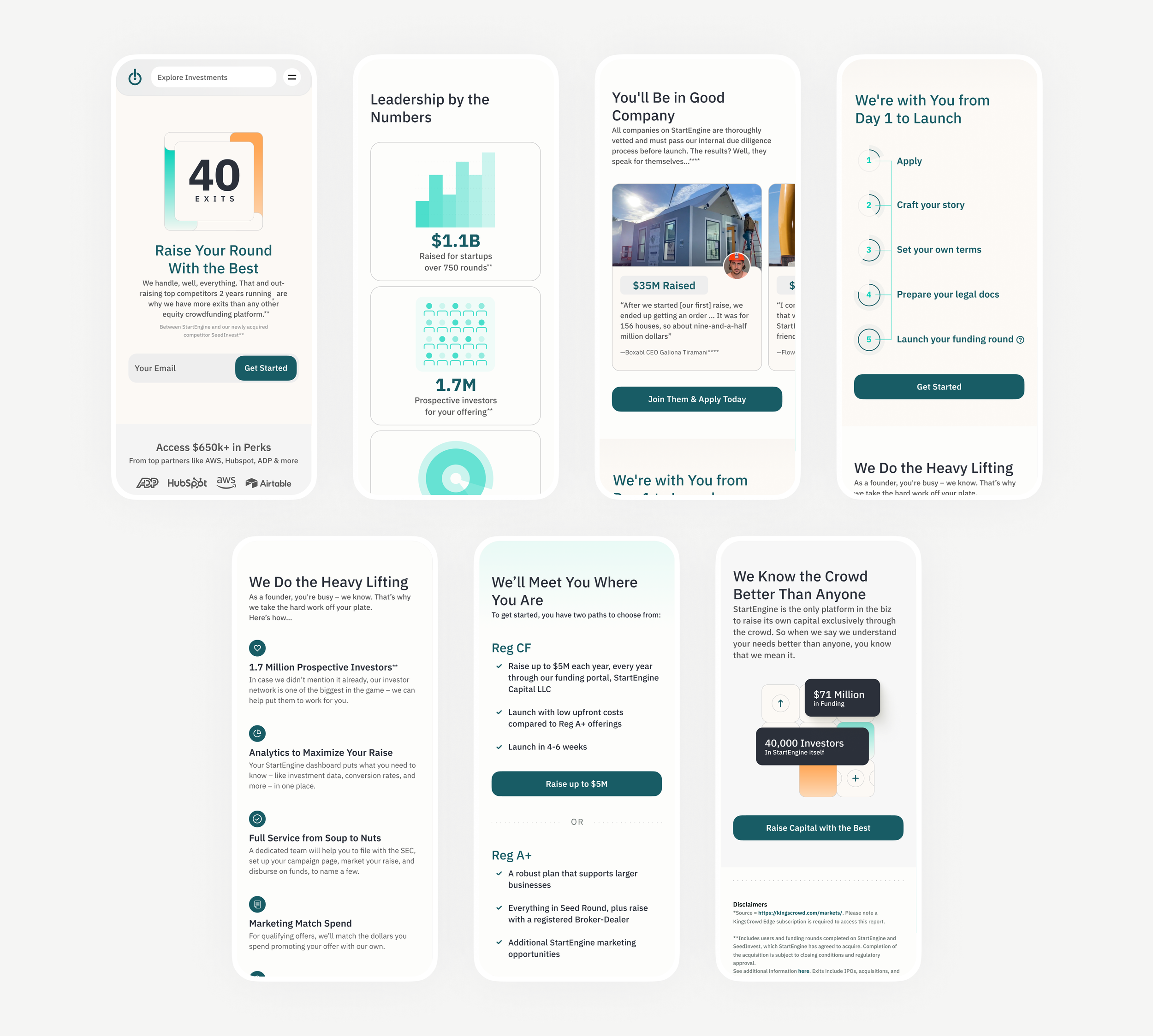
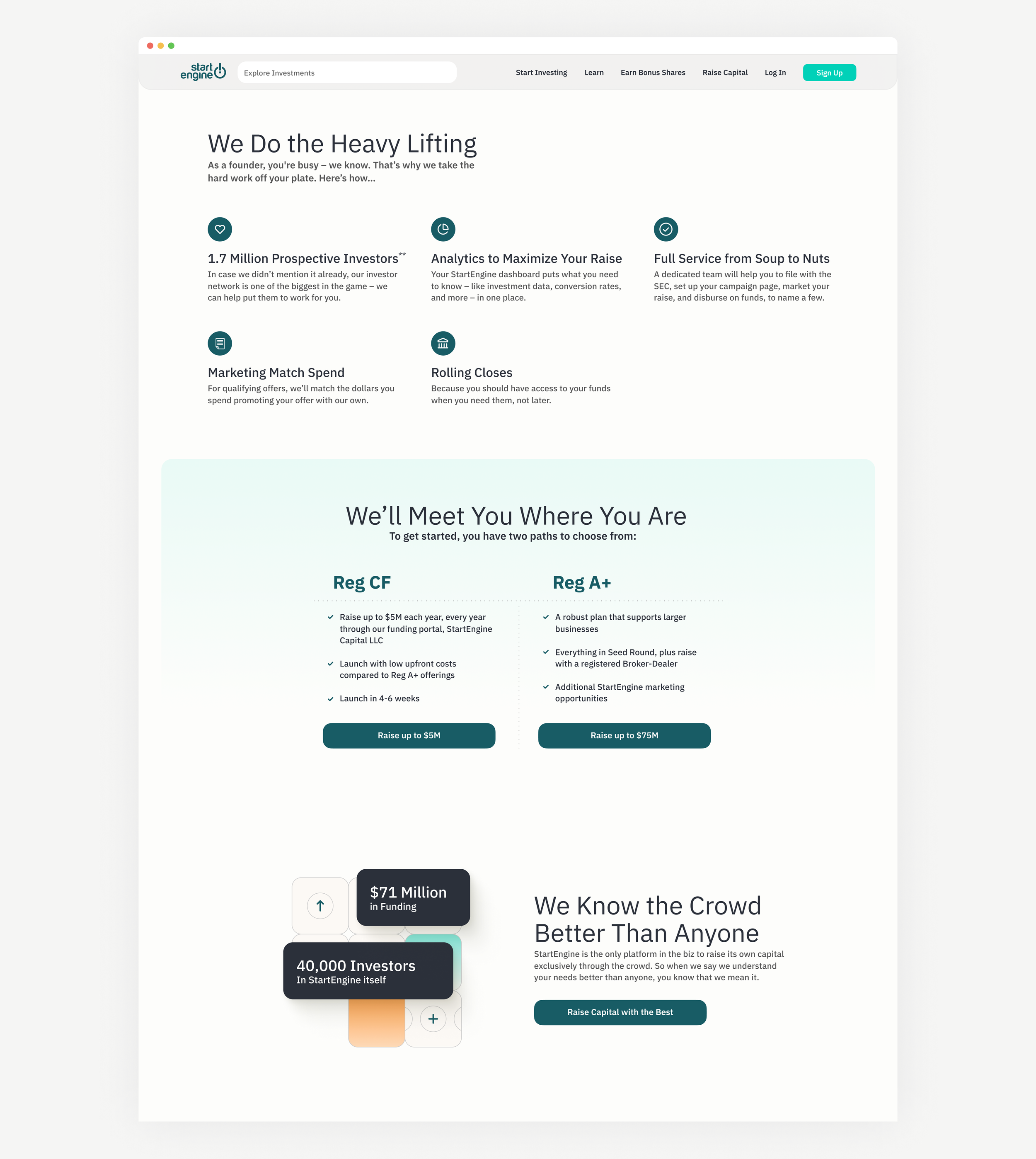
After

Learnings
The project emphasized the pivotal role of cohesive brand alignment and streamlined content presentation in optimizing user experience, resulting in reduced user drop-off and increased conversion rates. Redesigning and simplifying the desktop form, coupled with mobile optimization through segmented pages and progress indicators, notably improved user engagement and completion rates. Additionally, enhancing the form's written content transformed the user experience from daunting to user-friendly. The introduction of a new touchpoint on the thank you page extended user interaction beyond form completion, addressing previous dead ends.